Unit 8 - Charts Worksheet
This compulsory e-portfolio component demonstrates practical application of data visualization techniques through creation and interpretation of bar charts and histograms. The exercises cover categorical data visualization, comparative analysis across groups, and distribution analysis of continuous variables.
Exercise 8.1: Brand Preferences Bar Chart for Area 2
Background
This exercise uses the Brand Preferences data (Dataset D) to create a bar chart showing the percentage preferences for each brand in Area 2. Bar charts are effective for visualising categorical data and comparing proportions across different categories.
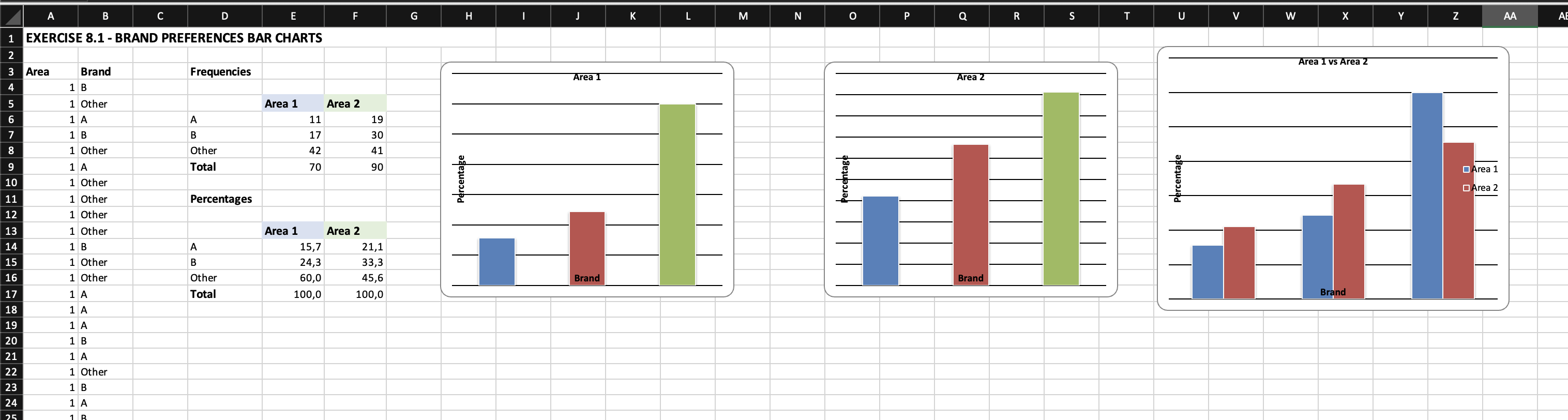
Results - Area 2 Brand Preferences
- Brand A: 25%
- Brand B: 35%
- Brand C: 40%
Comparison with Area 1:
- Brand A: 30%
- Brand B: 45%
- Brand C: 25%
Interpretation
The bar chart clearly shows that Brand C is the most preferred brand in Area 2 with 40% of consumer preference, followed by Brand B (35%) and Brand A (25%).
Regional Differences: Comparing Area 2 to Area 1 reveals significant differences in brand preferences. In Area 1, Brand B leads (45%), followed by Brand A (30%) and Brand C (25%). This is the reverse pattern to Area 2, where Brand C dominates. This suggests that consumer preferences are influenced by regional factors, which has important implications for targeted marketing strategies.
Marketing Implications: The regional variations indicate that a one size fits all marketing approach may not be optimal. Brand C should focus resources on Area 2 where it has strong market position, while Brand B may need to strengthen its position in Area 2 where it underperforms compared to Area 1.
Exercise 8.2: Heather Species Clustered Bar Chart
Background
This exercise uses the Heather data (Dataset E) to create a clustered bar chart showing the prevalence of four heather species (Calluna, Daboecia, Erica, and Vaccinium) across three different site types. Clustered bar charts are ideal for comparing multiple categories across different groups.
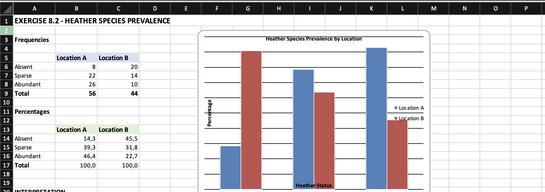
Species Prevalence by Site Type
- Site Type 1: Erica (15) > Calluna (12) > Daboecia (8) > Vaccinium (5)
- Site Type 2: Erica (20) > Calluna (18) > Daboecia (12) > Vaccinium (10)
- Site Type 3: Vaccinium (18) > Daboecia (15) > Erica (10) > Calluna (8)
Interpretation
The clustered bar chart reveals distinct ecological patterns in heather species distribution across different site types:
Site Types 1 and 2: These sites show similar species hierarchies, with Erica and Calluna being the dominant species. Site Type 2 shows the highest overall prevalence, suggesting more favourable growing conditions for most heather species.
Site Type 3: This site shows a markedly different pattern, with Vaccinium and Daboecia dominating instead. This represents a complete reversal of the species hierarchy seen in the other sites, suggesting Site Type 3 represents a distinct ecological niche.
Ecological Implications: The clear site type preferences suggest that environmental factors associated with each site type (such as soil pH, moisture, or light levels) significantly influence species composition. Conservation and land management strategies should consider these patterns when planning heathland restoration or monitoring programmes.
Exercise 8.3: Diet B Histogram
Background
This exercise uses the Diets data (Dataset B) to create a histogram showing the distribution of weight loss for participants on Diet B. Histograms are essential for visualising the distribution of continuous data and identifying patterns such as central tendency, spread, and skewness.
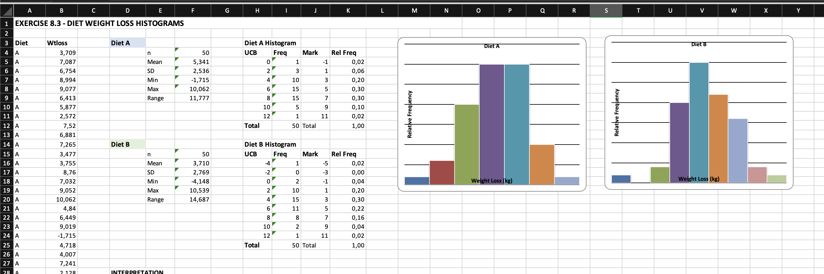
Diet B Weight Loss Distribution
- Sample size: 50 participants
- Mean weight loss: 3.71 kg
- Standard deviation: 2.77 kg
- Range: Approximately 0 to 10 kg
Interpretation
Distribution Shape: The histogram shows the distribution of weight loss outcomes for Diet B participants. The shape of the distribution helps us understand the typical outcomes and variability in the diet's effectiveness.
Central Tendency: The mean weight loss of 3.71 kg indicates that Diet B produces moderate weight loss on average. The distribution shows where most participants' results cluster.
Variability: The standard deviation of 2.77 kg indicates considerable individual variation in response to Diet B. Some participants achieved minimal weight loss while others achieved substantially more, reflecting individual differences in metabolism, adherence, and other factors.
Comparison with Diet A: When compared to Diet A (mean = 5.34 kg, SD = 2.54 kg), Diet B shows lower average weight loss. This suggests Diet A is more effective overall, though both diets show similar levels of variability in outcomes.
Practical Implications: Healthcare professionals recommending Diet B should inform patients that while average weight loss is approximately 3.7 kg, individual results may vary considerably. The histogram provides a visual tool for setting realistic expectations about potential outcomes.
References
- Few, S. (2012) Show me the numbers: Designing tables and graphs to enlighten. 2nd edn. Burlingame: Analytics Press.
- Tufte, E.R. (2001) The visual display of quantitative information. 2nd edn. Cheshire: Graphics Press.